Largemouth avatars, etc

TinBoats.net

Help Support TinBoats.net:

This site may earn a commission from merchant affiliate links, including eBay, Amazon, and others.

russ010

Well-known member
Joined
Jul 29, 2008
Messages
4,122
Reaction score
0
Location
Roswell, GA
I'm putting together a banner for our new jon boat club, but I need some avatars of LMBs or something. I don't have a clue how to draw them on any computer program (I do have photoshop, but I'm not that great with it)...

something similar to Jim's avatar would be awesome - but, I want something unique.

I was looking at the old tinboats sweatshirts we were trying to get an order together for, and the fisher catching the bass is really what i'm trying to do. I can draw it good on paper, but I can't transfer that into a computer program.

Anybody have an idea?

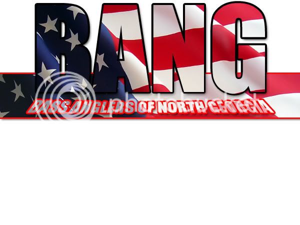
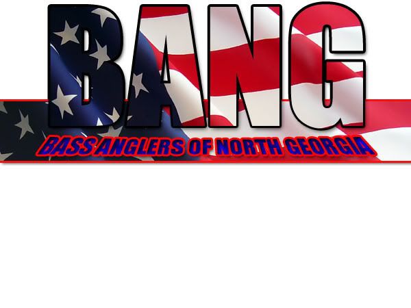
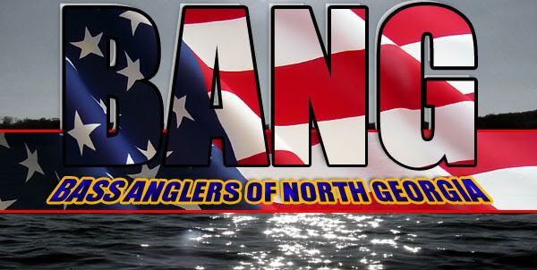
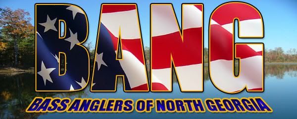
Our club is going to be called Bass Anglers of North Georgia (BANG). My plan so far is to have BANG in block letters, then have the fish coming out of the B, with a tinboat above the ANG... hard to explain, but use your imagination!

I guess maybe I should talk to Daryl at iguanagrafix... he might be my best bet. Whatcha think?
 
profiles_AngryElmo_4353_697210_media_medium.gif


a085-cartoon-bass-clipart.jpg


patch-largebass.JPG


istockphoto_5438106-monster-bass.jpg


A1736B-lg.jpg
 
If you can draw it on paper, just scan it in and save it as a .jpeg and then edit it and perfect it in Photoshop. Or bring in the big guns with Iguana Grafix. Sounds like a fun project and club.
 
Russ,

Since you've got the acronym working for ya, you might consider skipping the bass pic.

Maybe a hook, mountain, etc....

M2C.

Like the name tho!
 
Thanks guys... I've drawn something up on paper and I've really impressed myself.. hopefully I'll get to work on it some this weekend.. scratch that - I"ve got military, and I left my laptop at my house, which I"m not going back to... I'll catch up with you guys sunday night. thanks alot.
 
I am of no help to you, as my graphics skills are nonexistent. However, from what I have seen on a couple sights, Darryl does a lot of designing along with printing, and is probably a real good bet for you.
 
ok. well I've been piddling with this a little bit... Is this too much flag?

The first 3 are just the decals themselves - something I might have made into decals...

The last would be something for the website, kind of like a background, but it would be much lighter on the website

FlagBANGcopy.jpg


FlagBANG2copy.jpg


I think this is the one I'm going to go with - I like how the yellow highlights the wording...

FlagBANG3copy.jpg


FlagBANG4copy.jpg
 
fowlmood77 said:
Try removing the flag from behind "Bass Anglers of North Georgia" and see what that looks like. Just a suggestion.

And outline BANG in yellow to set it off from the background.
 
thanks for the ideas.. I hope I did all of these in the right layers so that I can easily delete them - becasue I have NO idea how I did half of what I did in Photoshop
 
russ010 said:
thanks for the ideas.. I hope I did all of these in the right layers so that I can easily delete them - becasue I have NO idea how I did half of what I did in Photoshop

If you use a seperate Layer for each item (and title it), then you have the flexibility to edit only the part of the image that needs to be altered without changing any other aspect of the image. If you click on the eye next to a layer it makes that layer invisible. Doing that will help you figure out what is connected to what. But you knew all that if you are working with layers in Photoshop, right ??

I like the work so far, but I think you are right about there being too much flag. The last image with the natural background should yield the best finished result. You might want to lighten up the background image a bit to make the text stand out a bit more and not make the whole thing so dark. Pretty good work if you don't know what you are doing. =D>
 
Thanks man... I might have to start all over - I tried to lighten the BANG flag, but for some reason it won't let me - but that was the easy part. I can alter the image in the background more, it was late last night when I finished and I was running on about 8 hours of sleep since Thursday (had military this weekend, and I do that in South Carolina, so I spent about a total of 18 hours in the car all weekend.)

I'm going to play around with it some more and see what I can come up with.

Thanks for all the help, I've got a Photoshop Bible - I guess I need to break it out and actually read up on it some more
 
They are both great work but what would the top one look like in an oval shape in lieu of the rectangle shape?
 
I'm still playing around with them... so not actually "done" yet!

Photoshop has TONS of different things you can do, and I'm just really learning to use it. I have no idea how I did most of what I did - it was trial and error.

The pictures on my computer at work look waaaaaay different than they do on my laptop too... so I can't really get a good feel for how it looks until I look at it on here or on my wife's laptop.

I'll play with it a little more tonight and see what I can conjure up!
 
Really nice work !!! Got all the elements of the design and it doesn't look as cluttered and overworked. You really brought out that background image nicely. You're a quick study. 8)

Playing around is one of the best ways to learn how to use software like Photoshop. For quick How Toanswers there are lots of tutorials online. I found books to be useful, but difficult to search through for specific how to topics. Online searching seems easier to me.

Take a look at this Google and work your way through the links.

Added Later... I was fooling with your image and lightened up the 2 dark blue areas in the flag a little. Truth be told, I like the darker shade.
 

Attachments

  • Bang Bass.jpg
    Bang Bass.jpg
    120 KB · Views: 164

Latest posts

Top